I was part of the group of the first 10,000 Kickstart backers who got the early bird special for the new Pebble Time watch! Since I loved my original Pebble, I’d thought I would write about my first impressions.
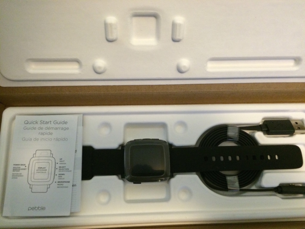
On Friday, June 5th I finally received my Pebble Time in the mail. However, due to some drama and/or issues with Apple, the required companion app wasn’t available on the iPhone app store until the next day. Still, I pulled the clever cardboard zipper and opened the box. I couldn’t do anything without setting it up with the companion app first, but now it’s all set up and on my wrist.
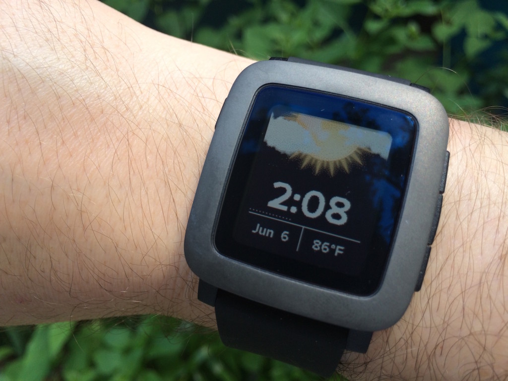
My first impressions are positive. I love the color screen and I’m able to read it in bright and low light with a shake or button press to activate the backlight. There is a setting to always leave the backlight on too.
I can feel the lighter weight difference immediately on my wrist. While washing dishes, cleaning house, playing videos games, writing, and bike riding the watch never got in my way, unlike my headphones that wanted to get caught on everything…
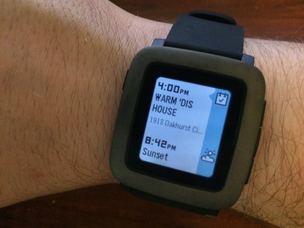
The timeline feature is fun, which I wasn’t sure how I was going to feel about it at first, but I like it now. Pressing the down arrow to see my daily outlook is a nice compliment to my Today Notifications on my iPhone, but does not have the detail, such as driving times, to replace it.
The vibration of notifications is as strong and noticeable as the original. If you’ve never had a smartwatch, I recommended getting one to cure phantom phone vibrations.
As with my last Pebble watch, I felt it got better as updates were pushed out and I’m sure the Pebble Time will be the same. Being an iPhone user, the microphone is useless at the moment.
This is a minor gripe, but I am going to say it so people can be aware of it. The Pebble Time did require a smartphone to set it up. Without setting it up, it won’t even tell the time. This may have been logistics solution for the first batch of watches. In their defense, why would buy such as watch without having a smartphone? Thought I’d mention it anyway.
With it being brand new, not every app has been updated for the color screen yet. None of the apps I own at the moment have an icon for them in the menu screen like Pebble’s Music and Settings. It’s just text. There’s a loading bar when opening some apps, which may be a feature to save on battery/memory.
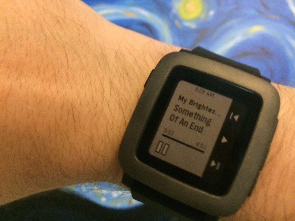
The first thing that has bugged me has been some the smaller text, like the time display in music. I have to bring the watch closer and steadier to my face to read it than I did with the classic Pebble watch. It could just be me, my surroundings, and the automatic backlight I had it set on. In any case, I bet there will be some update tweaks to make everything better.
Overall, I’m excited to own the new Pebble Time and I’m looking forward to future updates.
I updated this post on June 7 to elaborate more. Follow me on Twitter for more updates.
